

Your brand’s color is a critical asset, but translating it into physical retail displays can be a challenge. For B2B buyers, the goal is to create a cohesive brand experience that drives recognition and sales, yet questions about technical feasibility, minimum orders, and durability often stand in the way.

This article breaks down the practicalities of using custom colored mini balls for retail identity. We’ll cover how color can improve brand recognition by up to 80%, the technical process of Pantone matching for materials like glass, and the typical minimum order quantities you can expect from manufacturers to help you plan your project effectively.
Why Custom Colors Drive Brand Recognition
Custom colors are a primary driver of brand recognition, with research showing color can improve brand identification by up to 80% compared to monochrome. This is because color increases ad readership by 42% and is the main factor in 85% of purchase decisions, making a consistent, distinctive palette essential for brand recall and consumer trust.
| Metric | Impact | Key Insight |
|---|---|---|
| Brand Recognition | Up to 80% improvement | Color vs. black-and-white advertising. |
| Ad Readership | 42% more often | Color ads outperform monochrome. |
| Purchase Decisions | 85% cite color as primary reason | A dominant factor in consumer choice. |
| Visual Buying Decisions | 93% of consumers | Appearance, including color, is critical. |
| Impulse Buys | 90% driven by color | High influence on spontaneous purchases. |
| Global Brand Logos | 81.6% use ≤2 colors | Simplicity aids memorability. |
| Top 100 Brand Color | 33% use blue | Associated with trust and reliability. |

The Data Behind Color’s Impact on Memory and Sales
Research quantifies the direct link between color and business outcomes. Color improves brand recognition by up to 80% compared to black-and-white advertising. This significant boost is tied to higher engagement; color advertisements are read 42% more often than monochrome ads.
The influence extends directly to purchasing behavior. A decisive 85% of consumers cite color as the primary reason for their product purchase decisions. This visual factor is even more critical for unplanned purchases, with 90% of impulse buys driven by color alone. Overall, 93% of consumers base their buying decisions on visual appearance, where color plays a central role.
Strategic Palette Selection for Maximum Brand Identification
Leading brands apply color strategically to build instant recognition. A key tactic is simplicity: 81.6% of the world’s 250 largest companies use two or fewer colors in their logos, prioritizing clean, memorable designs over complexity.
Color psychology guides selection to evoke specific brand attributes. For instance, blue is used by 33% of the top 100 global brands—like Facebook and Visa—to communicate trust and reliability. For B2B partners and physical branding, the consistent application of a custom color across assets—from architectural features to retail displays—amplifies this identification effect, creating a cohesive brand experience that extends far beyond digital media.
The Psychology of Gold vs. Silver Mirror Accents
Gold and silver mirror finishes are defined by their underlying physics. Silver offers over 98% reflectance across the visible spectrum, creating a bright, neutral, and precise ‘cool’ effect. Gold, with its reflectance dropping below 550nm, absorbs blue light, producing a warm, rich hue and excelling in infrared applications. These inherent properties directly inform their psychological impact in branding.

The Optical Science Behind the Color and Feel
The distinct visual character of gold and silver mirror coatings stems from their fundamental optical physics. Silver coatings achieve 95-99% reflectance from visible light into the far-infrared spectrum, with performance dropping below 90% only in the ultraviolet/blue range below 450nm. This creates a high-fidelity, neutral reflection.
In contrast, gold coatings provide 98-99% reflectance in the infrared range from 0.7 to over 10 micrometers, but reflectance falls sharply for wavelengths below 550-600nm. This selective absorption of blue light is what produces its signature warm, luxurious color.
Beyond color, these materials have different durability profiles under specific high-energy applications. For example, the damage threshold for a protected silver coating is 0.5 J/cm² at a 1064nm laser wavelength, while protected gold can withstand 0.8 J/cm² under the same conditions.
Translating Physics into Brand Perception and Application
Silver’s broad-spectrum efficiency and neutral reflection evoke associations with precision, modernity, coolness, and clarity. This makes it ideal for brands wanting a sleek, high-tech, or timeless aesthetic, particularly in well-lit environments like retail displays where its high-fidelity reflection is a key asset.
Gold’s infrared stability and warm visual tone convey warmth, heritage, exclusivity, and opulence. It performs exceptionally in creating atmospheric depth in low-light or dynamically lit settings, such as luxury pop-ups or evening events, where its rich hue enhances a sense of luxury.
For architectural features or permanent installations, the choice may hinge on environmental stability. Both coatings require protective overcoats, but their different base materials—99.99%+ purity silver or high-purity gold—respond uniquely to long-term exposure, influencing their suitability for different applications.
Pantone Matching in Glass: Is it Possible?
Yes, Pantone matching in glass is achievable but involves specific technical processes and has inherent limitations. It relies on official Pantone glass standards or custom formulation services, with success depending on batch certification and understanding that color perception can vary with lighting and viewing angles.

How Pantone Matching Works for Glass
Pantone provides official glass-specific color standards through its TPG and TCX formats, such as PANTONE 11-0205 TPG Glass Green. These standards serve as a critical reference point for specification.
Specialized manufacturers also offer custom color mixing services. They create bespoke formulas and test them for firing stability and batch-to-batch consistency to match a desired Pantone color.
While the Pantone system is essential for specification, the final color in glass can be influenced by lighting, viewing angle, and production variables. It is a reference, not a guarantee of identical results under all conditions.
Technical Requirements and Practical Limits
Achieving reliable consistency requires working with manufacturers who use the official Pantone Matching System and provide color certification for each production batch. This batch-level documentation is a key technical requirement.
Pantone’s published color tolerances are generally not precise enough for touch-up applications. Matching an existing installation requires the original physical sample, not just the Pantone specification number.
For laminated glass, color effects can be achieved through tinted glass substrates or specially ordered colored PVB interlayers. This expands customization options beyond direct Pantone matching, offering flexibility for desired visual effects.
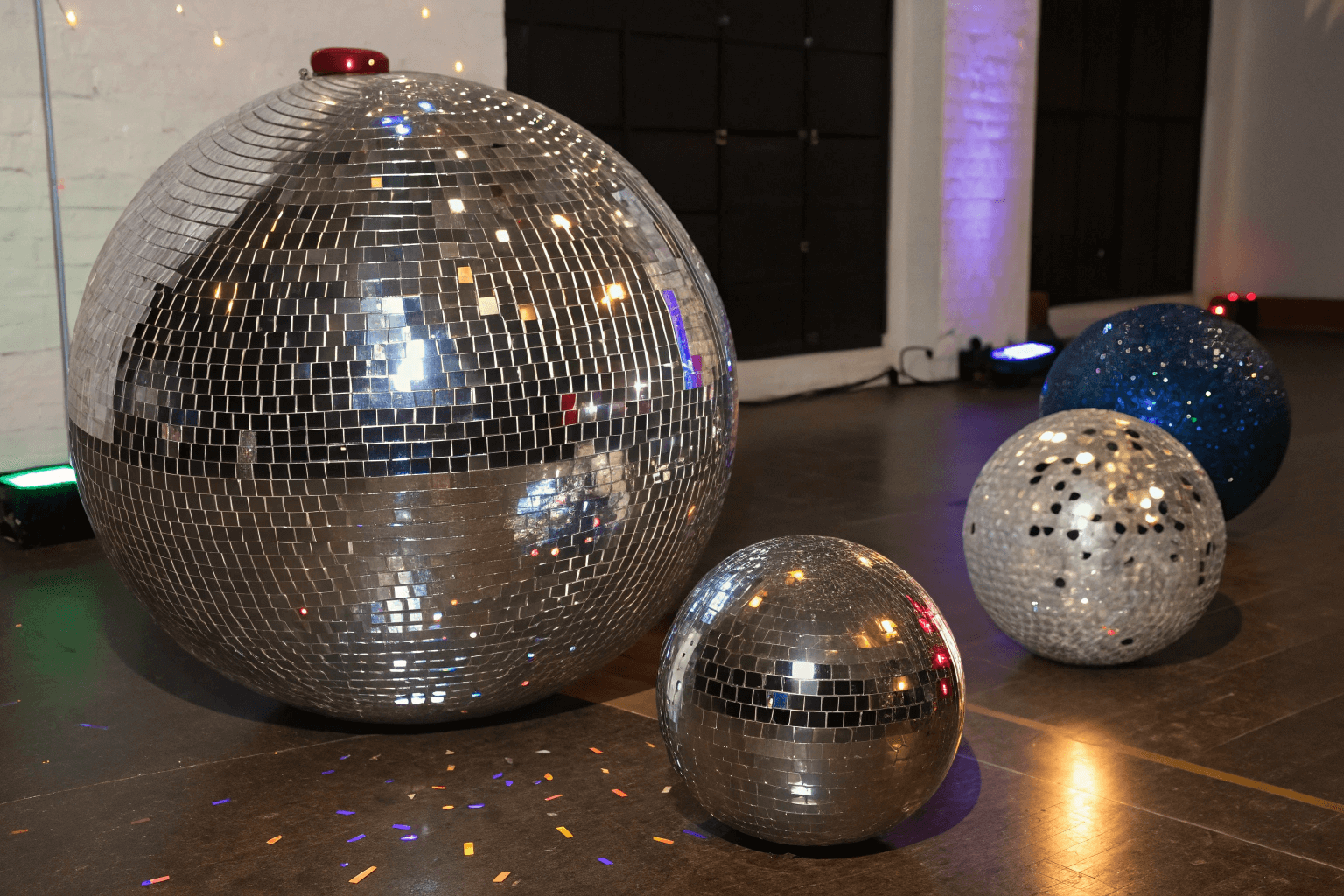
Source Commercial-Grade Mirror Balls, Direct from the Factory
Minimum Order Quantities for Custom Colored Tiles
Minimum order quantities for custom colored tiles are not standardized and vary widely, typically from 25 to 500 square feet. These thresholds are set by manufacturers to cover the fixed costs of mold creation, color matching, and small-batch production. For cost-effective projects, a 150-250 square foot order is often the practical sweet spot.
| Manufacturer | Minimum Order Quantity (MOQ) | Key Details |
|---|---|---|
| Tesselle | 150 SF | No surcharge at MOQ; orders under 150 SF incur up to a $500 surcharge. |
| Six3 Tile | 25 Pro Kits | For non-standard colors; 100 Pro Kits for a custom pattern. |
| Riad Tile | 500 Sq. Ft. | For custom encaustic cement tiles. |
| Maple Jude | 50 SF per color | 25 SF for black/white; 215 SF with a custom pattern from palette (+$350 setup). |
| LiLi Tile | 10 boxes | Box size is unspecified. |
| Fireclay Tile | No minimum | For custom colorways using standard colors; 100 pieces per custom screen. |
| Interstyle Glass | 80 SF | For glass tiles. |

Why MOQs Exist: The Economics of Custom Production
Custom production involves significant upfront fixed costs. Manufacturers must cover expenses like mold fabrication, which typically costs $300 to $600 per mold, and precise color matching, which can run $150 to $400 per shade.
Handmade processes, such as the dust-pressed hydraulic method used for cement tiles, require batch minimums. These MOQs allow manufacturers to amortize the initial setup costs across enough units and prevent material waste in a non-automatable, artisanal workflow.
Orders for custom colored tiles are typically non-cancelable. The custom molds and specific pigment batches created for a project are perishable and cannot be repurposed for other orders, making the commitment final once production begins.
Industry MOQ Benchmarks and Cost Implications
MOQs vary significantly by material and manufacturer. For example, cement tile providers like Riad Tile require a 500 sq. ft. minimum, while others like Tesselle set their threshold at 150 sq. ft. Glass tile specialists such as Interstyle Glass have an 80 sq. ft. MOQ, and kit-based offers from Six3 Tile start at just 25 units.
Falling below a manufacturer’s stated MOQ usually triggers a surcharge to cover the fixed production costs. A clear example is Tesselle, where orders under their 150 sq. ft. minimum incur a fee of up to $500.
Durability of Tinted Glass vs. Surface Coating
Tinted glass, where color is integrated into the material, offers superior inherent durability with a lifespan of 20-25 years. Surface coatings vary widely; pyrolytic hard coats are highly durable and post-temperable, while soft coats have significant limitations including susceptibility to scratching and degradation.

The Inherent Strength of Tinted Glass
Tinted glass is created by blending metal oxides directly into the glass melt, making the color a permanent part of the material’s body.
This integration provides excellent resistance to environmental factors like UV exposure and moisture, contributing to a typical lifespan of 20 to 25 years with proper maintenance.
The material’s durability is uniform; scratches or wear on the surface do not affect the color, which remains consistent throughout the glass thickness.
For permanent architectural features or high-traffic retail displays where long-term brand consistency is critical, tinted glass is often the preferred choice.
Understanding Coating Types and Their Limits
Pyrolytic coatings (hard coats) are applied at extreme temperatures (over 1200°F), creating a durable, bendable layer that can be applied before or after glass tempering, with no shelf-life restrictions.
Soft coatings, such as common Low-E layers, are applied in a vacuum chamber and have inherent vulnerabilities: they can be easily scratched, deteriorate with air exposure, and often restrict fabrication options.
Warranty periods reflect this performance gap; high-quality pyrolytic coatings typically carry commercial warranties of 10 to 12 years, while soft coats are less robust.
The choice impacts design: for complex curved shapes or projects requiring post-manufacture tempering, a durable pyrolytic hard coat may be the only viable coated option.
Seasonal Rollouts: Matching Brand Palettes (e.g., Tiffany Blue)
For a seasonal rollout, matching a brand’s trademarked color like Tiffany Blue requires precise technical specifications. This involves using the official Pantone PMS 1837 for physical materials and the HEX code #0ABAB5 for digital assets to ensure visual consistency across packaging, signage, and pop-up displays, protecting the brand’s luxury identity.

The Foundation of a Signature Color
A signature color like Tiffany Blue is a core brand asset, legally registered as a color trademark since 1998.
Seasonal rollouts use this color to create immediate brand recognition and emotional connection in pop-up displays or limited-edition packaging.
Deviating from the exact shade risks diluting brand equity and confusing customers, making precision non-negotiable.
Technical Specifications for Exact Matching
The authoritative reference is Pantone PMS 1837, a private custom color formulation created for Tiffany & Co.
For digital screens and web assets, the primary HEX code is #0ABAB5 (RGB: 10, 186, 181).
For printed materials, use a CMYK mix of 95% Cyan, 0% Magenta, 3% Yellow, and 27% Black to achieve a faithful print match.
Working with a manufacturing partner experienced in custom color ensures these values are correctly interpreted for materials like tinted glass or surface coatings.
Case Study: Cosmetic Brand Pop-up Displays
Cosmetic brand pop-ups use modular, portable displays with integrated lighting to create immersive brand experiences. Key features include lightweight aluminum frames, dye-sublimated graphics, and interactive elements like touchscreens, which have been shown to reduce setup time by days and increase in-store engagement by over 30%.

Design and Construction of Modular Pop-up Displays
The physical design of these pop-ups centers on modularity for speed and ease of use. Builders use lightweight aluminum frames combined with poly-stretch fabric graphics, enabling a full backdrop to be assembled in under two minutes. This approach directly supports the fast-paced needs of retail activations.
Standard footprint sizes are designed to fit within common retail spaces. Kiosks typically measure 8×8 feet or 10×12 feet, with heights kept under 8 feet to comply with mall and store regulations. This compact sizing ensures the displays can be deployed in high-traffic areas without obstruction.
Portability is a critical feature. Entire systems are engineered to fold down into luggage-sized carrying cases, making transportation between different store locations or events straightforward and cost-effective. This eliminates the need for specialized freight.
Safety and accessibility are built into the design. Manufacturers use fire-resistant materials and ensure the structures meet ADA compliance standards. This guarantees the displays are safe for public use and accessible to all customers in a retail environment.
Interactive Features and Measured Performance Outcomes
Integrated lighting is fundamental for product presentation. Displays commonly feature LED strip lighting, gradient backlights, and adjustable spotlights. This lighting strategy not only enhances product visibility but also creates a specific aesthetic, often mimicking a clean, scientific lab environment that aligns with skincare brand narratives.
Interactive technology drives direct customer engagement. Features include touch screens for analyzing product ingredients, transparent tabletops with circular lighting for testing products, and QR codes on illuminated columns that unlock digital content. These elements transform a static display into an experiential “skin lab.”
The operational benefits are quantifiable. Case studies show that modular pop-up systems can reduce setup time by up to three days compared to solutions from previous vendors. This efficiency translates into lower labor costs and faster time-to-market for promotional campaigns.
The impact on business metrics is significant. Documented results include a 32% increase in in-store customer engagement. Furthermore, a beauty brand using a modular LED-lit acrylic countertop display reported a 26% increase in monthly unit sales over a four-week activation period.
Final Thoughts
Custom colored mini balls are more than just decorative accents; they are a direct extension of a brand’s visual identity. The data shows that color is a primary driver of recognition and consumer choice. By translating a brand’s specific palette into a physical element like a custom mirror ball, retailers can create a cohesive and memorable in-store experience that reinforces brand equity at every point of customer interaction.
The technical considerations—from achieving precise Pantone matches and understanding the durability of materials to navigating minimum order quantities—are practical steps in this branding process. Each decision, whether selecting a warm gold finish for a sense of heritage or a specific tinted glass for longevity, contributes to a consistent brand narrative. When executed with precision, these custom elements transform from simple decor into strategic tools that build recognition, influence perception, and ultimately, support sales.
Frequently Asked Questions
Can I get custom color mini disco balls?
Yes, custom color mini disco balls are available. BDB specializes in bespoke production, offering specific colors, sizes as small as 2.35″ in diameter, and advanced features like integrated RGB LEDs for dynamic color-changing effects. This allows for precise alignment with brand identity or event themes.
What is the MOQ for gold mini mirror balls?
The minimum order quantity for gold mini mirror balls typically starts at 36 pieces, which is often structured as 12 packages of 3 pieces each. For larger custom or bulk wholesale orders, MOQs can begin at 500 pieces. BDB’s dedicated account managers can provide specific quotes based on project scope and customization needs.
Is custom branding possible on small disco balls?
Yes, custom branding on small disco balls, typically in the 2–6 inch range, is a standard service. Options include applying printed decals, laser-etching logos for a permanent finish, or using precision-cut vinyl. For high-impact displays, programmable LED-integrated frames can also showcase dynamic branding.
How do I match decor to my exact brand colors?
You can match decor precisely by providing a Pantone (PMS), RAL, CMYK, or RGB color code. BDB uses spectrophotometers and controlled lighting in light booths to replicate your color on materials like glass or acrylic. The process involves a setup fee to ensure color accuracy and consistency across your order.
Do colored mirror tiles scratch easily?
Scratch resistance depends on the material. Glass mirror tiles can be scratched by abrasives like sand. Acrylic mirror tiles with a protective hard coat offer better resistance, often tested to show less than a 5% haze change after 100 abrasion cycles, making them a durable choice for many applications.
What are the best colors for luxury retail decor?
Luxury retail decor often uses desaturated, muted tones paired with dark neutrals like charcoal, navy, or deep teal. Accents in gold or silver mirror add sophistication. Research indicates low color saturation is statistically linked to higher perceived brand status, helping create an exclusive and premium in-store atmosphere.